Client
Terracqua
Services
Art Direction, Branding, Packaging Design
Their Story
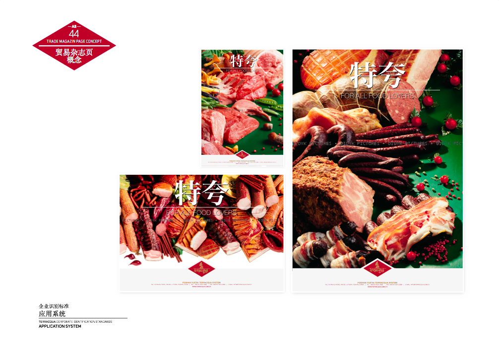
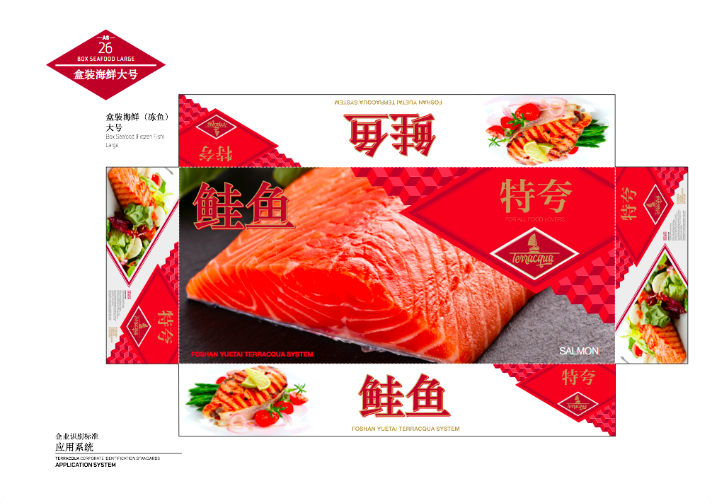
“Terra” means land and “acqua” means water. Terracqua, a Chinese company, seeks to bring European methods of cooking fish and meat to China. It’s safer, healthier and a completely new way for the Chinese to enjoy animals from the “terra” and “acqua.” Despite the novelty, the brand wanted an identity which was sentimentally Chinese and rooted deep in its culture and sentiments.
Our Story
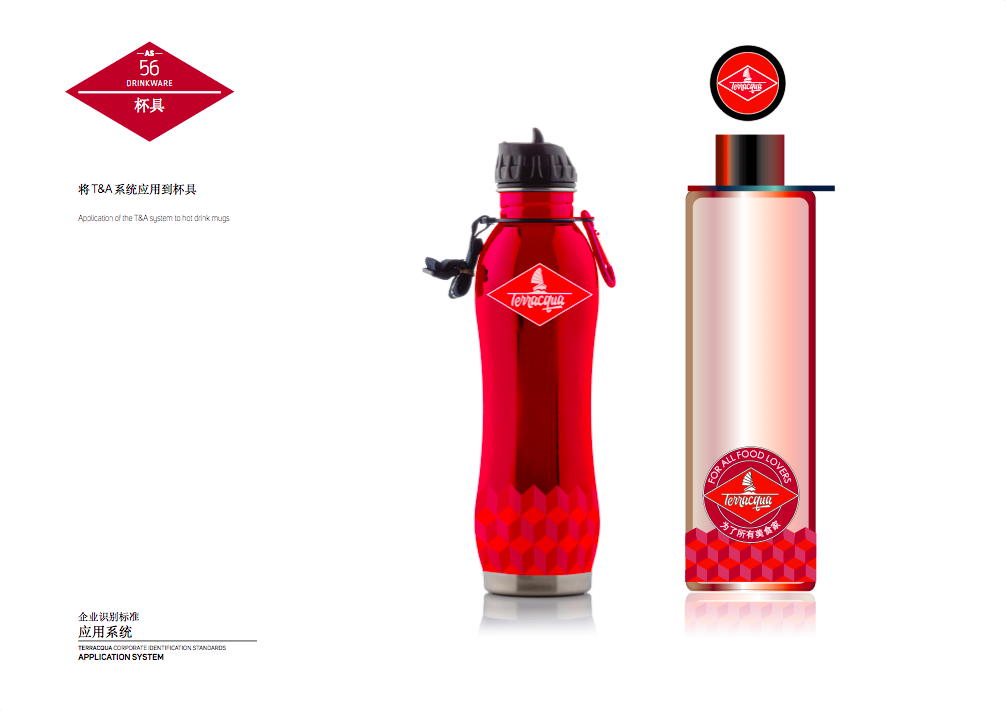
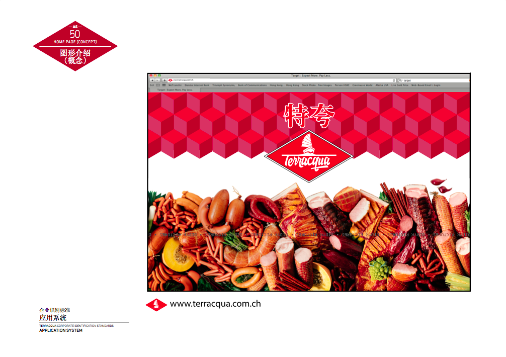
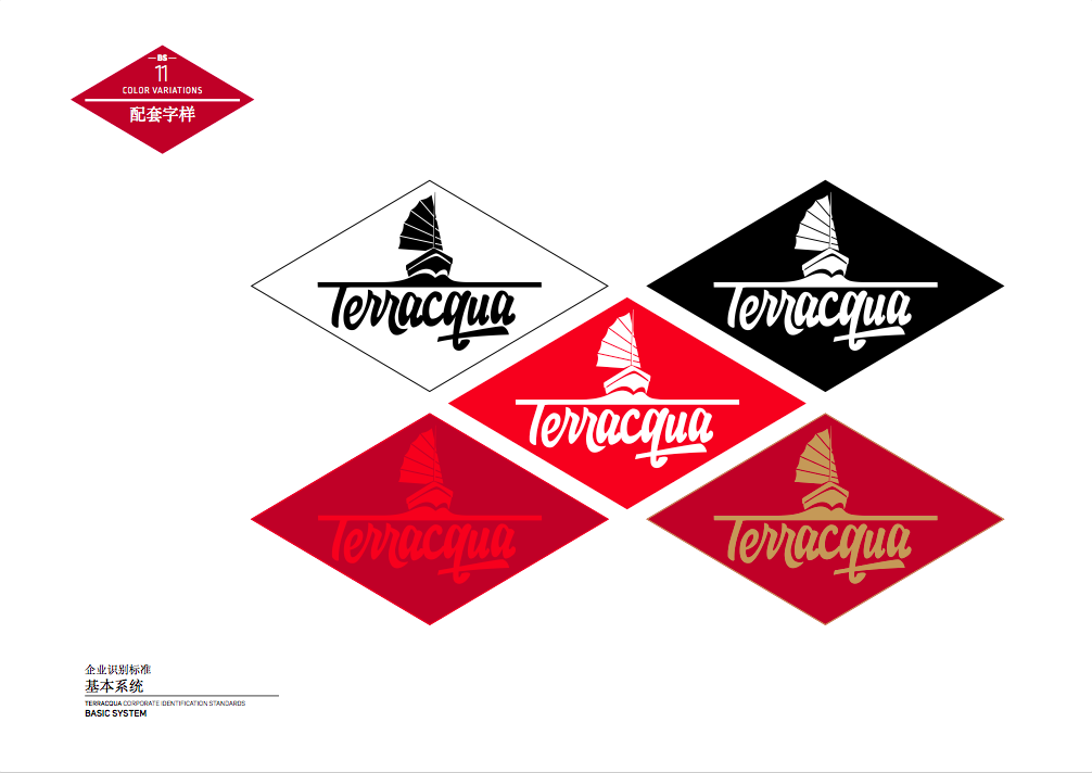
A project that took us into the rich history of ancient China – Terracqua’s logo tells the tale of Zheng He. Commander of the mightiest fleet in history, his 300 red sailed ships during the Ming dynasty brought to China luxuries and other items of wonder from all corners of the world. Soon enough, these red sails became a symbol of emerging modern China. Terracqua’s ambitions of showing the Chinese new ways to cook meat and fish resonated with the legacy left behind by He. And so, we decied to pay tribute to the first explorer to open China up to new ways of living by reviving his distinctive red sails.
Identity
Applications
